Runet is poor in reviews of redesigns of well-known sites and services. This article is not about fixing that. My goal is to discuss with the community a solution to one of the problems of the VKontakte web version.
In last year's competition for the redesign of VK, the authors of the competition mentioned the problems of the web version. They named the narrow width of the site as the number one problem. I agree with the VKontakte team and decided to build my own solution to combat this problem.
Pain
Problem #1 - Narrow screen

In addition to screen width, I identified 2 more problems.
Problem #2 - Different style of the web version and applications

Problem #3 - Messenger
Messenger appeared on VK relatively recently. Its first version was noticeably out of style, and over time this was resolved. The main problem of the messenger, in my opinion, is that it lives in parallel with the site. The correspondence window is small. And although it is scalable, it is tied to absolute coordinates - it is not convenient to use the service. On Facebook, the messenger also lives separately from the site, creating many small correspondence windows.
Theory - ways to become wider
Let's first decide what a narrow screen is. The current width of the VC is 791pcs. The competition task said to adapt the site to a resolution of 1024pk. As I see it, the solution to the problem of a narrow screen will be an interface that works at a resolution of 1024-1600pcs. That is, the interface is capable of working both at a narrow (1024pk) resolution and at a wide one (1440+pk).1. Physical stretching
The solution is straightforward - we make the site rubber.
Pros:
+ Easy to implement
Minuses:
− Content becomes unreadable
− It is necessary to completely revise some sections of the site (for example, friends)
2. Parallel presentation
The technique was seen in iA's 2006 Facebook redesign concept - comments are located to the right of posts. 5 years ago I tried it on one of my projects.
Pros:
+ Posts are arranged linearly, without being interrupted by comments
+ Comments on posts are visible immediately without additional transitions
Minuses:
− Uneven density of information on the screen
− A version for 1024pcs can be created with great difficulty or is forced to differ from the wide one
− It is necessary to completely revise some sections of the site
3. Sliding panels
An approach that has become popular in web services: SRM systems, task managers. The screen consists of dependent panels. Panels appear to the right of each other; if the screen does not contain everything, then the left panels are hidden as the right ones appear.
Pros:
+ At small resolutions you can switch panels, at large resolutions you can show everything at once
+ Similarity of the interface with the version for tablets
Minuses:
− An option not familiar to web users
− The site is not located in the center of the screen, but on the left
− Large volume of architectural work
− No linear viewing; you need to click on the news to read the comments
4. Two windows
Interface with two active work sections on the screen.
Pros:
+ Requires few changes to the current interface
Minuses:
− It’s not clear how to work with 2 modes at the same time and why
5. Two columns
The information display mode is similar to the timeline on Facebook. The concept based on this option is won in the VK redesign competition.
Pros:
+ Easy to organize information
+ Uniform data density on the screen
Minuses:
− Divided attention when reading news
− Facebook
6. Cards
Shifting from vertical storytelling to a grid. Example - Pinterest.
Pros:
+ Easily scales to any resolution
Minuses:
− Difficult to perceive content (difficult to relearn)
− It is necessary to completely revise all sections of the site
Practice is my solution
I based my solution on the 4th approach: a screen with two active windows. The second window is the messenger. This allows you to chat while reading the news. Without using 2 browser tabs.
On small (<1440пк) экранах окно чата сворачивается.

If desired, it opens on top of the main content. The scenario of chatting while reading the news works the same way.

The user panel itself with the latest correspondence remains on the screen in all sections of the site:


Behind the scenes details
If you look closely at the screenshots, you can see other changes in the interface:
1. Background. A background has been added to increase the contrast of the blocks.

2. Division into blocks. The posts were separated into independent blocks.

3. Likes have moved up. Perhaps the most controversial change and probably deserves a separate discussion.
4. The previous top menu has disappeared. All its functions have already been duplicated in sections of the site. In its place was the tab level. Thus, it was possible to reduce one navigation floor. Filters (a rarely used item) have moved to the drop-down list. Another navigation floor is missing.
5. Two modes for viewing friends. One is borrowed from the web version, the other from the tablet. It is difficult to assess which is more popular and more convenient.

6. Personal notes. A block of personal notes about each friend appeared. If you like it, get it here - VK Memos.
7. Web calls. They were already in VK before, but were made as a separate mode of operation. Now this is an invisible function that does not interfere with basic surfing and communication.

Instead of a postscript
Is it possible to redesign a social network without a prototype of the user page?The current version is overloaded with information: music, videos, groups, public pages, photographs, photos on a map, photo albums, friends, mutual friends, online friends, subscribers... I decided to cut off all the unnecessary stuff:

That's all, thanks for your attention.
Everything is bad
I assess this redesign as not up to a professional level: too many important functions of the site were made worse than they were, and the little things that complemented and made the site different were removed or turned into trash.
It was worth introducing the redesign gradually
A lot of work was done, and this is understandable: they restarted everything at once, which is fundamentally wrong. It would be better to update the site in parts, as Facebook does. After all, the user needs to be prepared for something new, new things need to be tested in parts and then gradually launched based on feedback.
Blue coffin nailed at the top
A fixed header can be made like this if it contains important content. Now there is nothing in it, except for the search and the audio recording icon, a solid fixed coffin that is distracting.
The news page has become narrower and more cluttered
The photo began to open like on Facebook

Top 5 less noticeable flaws
Implicit to the eyes, but obvious to the brain. Here are the key ones.
- Pictogram icons in the menu
- Pale gray background that took away the purity of the old version
- The left column in the profile is fixed when scrolling and does not allow the news to expand to the full width of the allowed content (as it was in the old version)
- The new logo does not fit into the header and creates even more empty space
- My activity indicator (online) in my profile! This is the edge of logic! Not only is there a text indicator next to my profile name, but now there is also a green circle
The most annoying thing for users

Is it really that bad? Alternative expert opinion
Victor Kozyrev
UX designer at Frog Design, Badoo and Cogniance; creator of the Spender app
“Perhaps many people expect more radical and aggressive steps in design from large companies, but, in my opinion, VKontakte took a pragmatic path and solved specific problems. The new visual style is striking, which has definitely become more modern and pleasant. Navigation has also been redesigned and simplified. Now everything looks more concise and is easier to perceive. The typography is neat, clean and contrasty, ensuring a comfortable experience for most users.
The VKontakte font that a user sees depends on their version of the operating system and browser (iOS users will see San Francisco fonts, and Android users will see Roboto). Due to the use of system fonts, the user receives an almost familiar and therefore unobtrusive, comfortable look-and-feel product.
You should be prepared for the fact that the majority of the audience will be indignant in any case, regardless of the nature of the changes. This is understandable: the average user cannot always immediately assess the potential benefits of changes. But the discomfort from the loss of familiar amenities is felt immediately. Not because the old solutions are so good, but because people are used to them. This is explained by psychology. Most of the audience will be annoyed by the very fact of the redesign in principle. And the reason can be any detail that sticks out the most: someone will notice the difference in the font or icons, and someone will find fault with the new navigation.
I personally am not a fan of the three-column layout and would try to simplify it to make the pages easier to read. In particular, this applies to the user profile. The page seems overloaded, visually homogeneous, and lacks correctly placed visual accents. Despite the greater number of similar solutions, VKontakte still looks cleaner and more modern, and the interface is easier to perceive.”
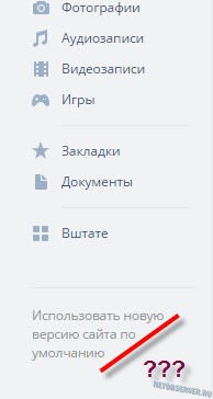
If you still want to return the old VKontakte design, then download the Stylish browser extension. After installing it, you need to open the style page for the old social network design, click the “Install with Stylish” button, confirm the choice of the new style and restart the browser.
- I'm not kidding. Since the transition to such an interface is obviously inevitable for everyone, the question is: how to return the old VKontakte design has only a temporary solution. But because albeit temporarily, but disable the new VKontakte design and it’s still possible to continue working with the usual sane interface, then that’s what we’ll do.
This question is relevant, perhaps, for all VKontakte users who, over 10 years, have become accustomed to the simplicity and convenience of the old design and use its functionality to the fullest. In particular, this applies to those who created and administer communities and groups - the developers of the new VK.com have certainly made their lives difficult with their innovations.
By the way, for this category of VK users I would like to give a practical recommendation: in order not to waste precious time on independent public promotion both on VKontakte and in all other popular social networks, and to fully concentrate on quality content for your community, you should contact the service Soclike. Judging by the numerous positive reviews, this PR team knows their business and will be able to quickly provide your group with the required number quality subscribers.
Let's return to the main question. Let's make a reservation right away - we will talk about browser version social network. Android and iOS applications, alas, will not be considered in this article.
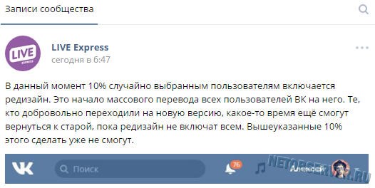
Upd. 08/17/2016. Dear Reader, in order not to waste your precious time, I would like to immediately inform you: “The uprising has been suppressed, Skynet has won.” Well, jokes aside, the inevitable happened: despite all the protest sentiments of VKontakte users, the developers, after several “waves” of transferring users to the new design, decided that enough wasted time: on 08/17/16 ALL users of the social network were transferred to the new design... Accordingly, the addresses are new .vk.com simply does not exist at the moment, and recommendations using its return do not work...
This does not mean that there are now no ways to return the old VKontakte design: especially for those who do not give up, we suggest that you familiarize yourself with the ““ block located below in the text. There you will find a method that will probably be able to extinguish the flame of righteous anger in you.
Well, before this block there will be information that has more historical than practical significance: the chronology of the fight against the disease called “ New design of Vk.com". Getting acquainted with this information will not take you, dear Readers, much time, and probably someone will be interested in knowing “how it all began,” so all previously working methods remain in the article. So let's begin.
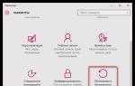
For those who have become a “guinea pig” for VKontakte designers involuntarily (i.e., they simply encountered a new interface at a certain moment), there should be a link “Return to the old version...” located at the bottom of the left column with menus and advertising. In truth, the designers clearly tried to make the tool for how to return the old version of VKontakte as inconspicuous as possible: gray letters on a gray background - this is difficult to notice.
Those who voluntarily joined the “ranks of testers” of the new interface (by clicking on the ill-fated “Join testing” button) may not find a link to return to the old version.
And how to disable the new VKontakte design in this case?
Pay attention to the browser address bar:
 Attention to the address bar!
 As you can see, before vk.com “ new" Those. in fact, it is another user profile page. To return the usual vk.com/page_id, and with it to return the old version of VKontakte, we simply “edit” the address: you need to erase “ new." And, of course, press Enter (or the input confirmation key on a touch device).
The result will be like this:
 We removed “new.” from the address and got what we needed!
 Sound familiar? Probably to the point of pain :) Yes, yes, this is the good old vk.com interface, which everyone has gotten used to over the 10 years of its existence. Well, now it’s a small matter: all that remains is to bookmark this page in the browser, so as not to edit the address every time, and call up this page after logging in to the social network.
It is not yet known when exactly the redesign of VKontakte will “cover” everyone, so there is hope that the old version of vk.com will be able to be used for a long time.
Upd. 06/09/2016. It seems that the “old believers” did not rejoice for long: the VK.com team began a forced transfer to a new design without the possibility of returning to the previous version.
Upd. No. 2 - joyful (not so joyful anymore - has lost its relevance...)
It turns out that there is still a workable method to return the old VKontakte interface even to those who seem to have been left with no options (at least for this method, VK has repeatedly thanked the “prompter”). However, we warn you right away - you will have to perform all actions at your own peril and risk, and there may be a risk. The method of returning the old vk.com design is associated with running scripts, and Netobserver does not guarantee that the body of the script does not contain code capable of stealing user login and password.
Let's consider a really working method, suitable for the Google Chrome browser and its “brothers”, like Yandex.Browser (browsers on the Chromium platform):
So, the method is as follows: find it on Google Playmarket

Install the first plugin in the list:

After installation, the activity of the plugin can be checked by the icon in the upper right corner of the browser:

In the tab that opens, click on the “Install this script” button: 
Next, a warning from Tampermonkey will appear stating that only reliable scripts should be run (i.e., it once again warns - you act at your own peril and risk), and the installed script will be displayed:

That's all - the script immediately starts working. All you have to do is go to VKontakte (or refresh the page if you are already there) and make sure for yourself that the good old vk.com is back!
Moreover, the effect will persist both when moving between elements of the VKontakte menu and when logging in again.
This is more convenient than the method that was proposed in the comments to this article (however, I would like to say “Thank you” for this option for solving the question “How to return the old VKontakte design”).
There are also extensions similar to Tampermonkey for other browsers:
- For Ognelis: ;
- for Opera: ;
- at Safari - .
Well, after installing the extension for your browser, return to the step of downloading the user script - and then in order :)
Upd. 3 - for the most persistent.
Dear readers, you have 2 options: accept it and start getting used to the new design (this is difficult, but possible - I say from my own experience), or fight to the end :) The remaining way to fight is to use custom styles. There are several of them currently being developed, and all of them are still very crude. But, as they say, in the absence of fish and...
For enthusiasts who do not give up and are ready to get confused, we have prepared the following recommendations:
- Using a custom script via Tampermonkey;
- Using the Stylish browser plugin with style loading(most popular option) .
For those who have already learned to work with Tampermonkey (see description in Upd.2- above in the text), an alternative script is proposed (though very crude), returning some semblance of the old version. There’s probably little point in using it for now, but you can track the changes being made—I’m sure that after a while this custom style will work much better.
https://userstyles.org/styles/userjs/128986/%D0%A1%D1%82%D0%B0%D1%80%D1%8B%D0%B9%20%D0%B4%D0%B8%D0 %B7%D0%B0%D0%B9%D0%BD%20%D0%92%D0%9A.user.js
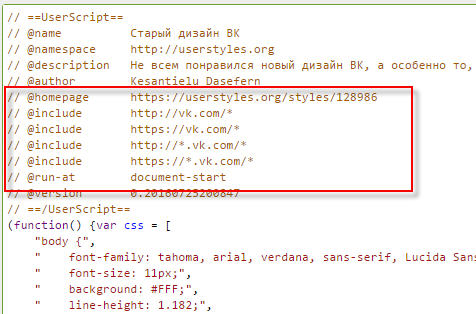
The script will need to be edited. Specifically interested in the following lines (from 7 to 10):
// @include http://new.vk.com/*
// @include https://new.vk.com/*
// @include http://*.new.vk.com/*
// @include https://*.new.vk.com/*
You need to remove "new." on lines 7 and 8, ".new" on lines 9 and 10.
It should look like this:
The Stylish plugin is the most popular option for returning the old VKontakte design
In principle, the algorithm of Stylish is similar to the method of Tampermonkey, with the only difference being that Stylish, unlike the latter, works with styles, not scripts.
Attention: Do not run Tampermonkey with Stylish! Although both plugins are designed to do, in principle, the same thing, it is not a fact that using them together will lead to twice the best result (rather, the fact is that it will not :)
So, if you have already tested the first method and decide to move on to the second, first deactivate the Tampermonkey plugin.
What should the user do first? Of course, download a plugin suitable for his browser. Links below:
After installing the extension, you need to make sure that it is activated. For Chrome, the picture will be as follows: an icon with the letter “S” will appear in the upper right corner of the browser:

The next step is to download the style from the developer's website: .
On the page that opens, you will need to use the big green button - it’s hard to miss:


Judging by the speed of releases, the author is trying very hard to eliminate all the currently existing shortcomings. Therefore, I recommend that you bookmark this page so that after a few days (weeks) you can download the modified style for Vkontakte, which will no longer be so crude.
In the meantime, let everything be the same for you as the lucky person who left this review:

Dear readers, if you have alternative methods for solving a return to the old VKontakte design, do not hesitate to leave them in the comments! We are also waiting for feedback from those who were helped by the recommendations presented.
Good mood to you all!
Article How to return the old VKontakte design - disable the new version was modified: May 4th, 2017 by Netobserver
Today at the Dribbble Meetup conference, Pavel Shumakov, leading designer of VKontakte, presented the new design of the VKontakte website, the company’s mobile clients on iOS and Android, as well as a completely new photo application.
VKontakte preferred to prolong the intrigue about the new site design and even blurred the screenshot at the presentations. But this example is enough to form a general impression of the redesign. The site is divided into so-called “islands” - each post or any other block is visually separated from each other. The site width and font will be increased.
Deadline: until the end of 2015.
Photo application VKontakte

Personally, we were more interested in looking at a completely new product from VKontakte - photo app. This is a kind of analogue of Instagram. It was announced back at our LIVE Event 2014, but we, like you, saw it for the first time only today, and were impressed. The new application is being developed together with professional photographers. In it, in addition to the obvious features such as color correction, you can create your own filters and share them with friends. The application is fully synchronized with VKontakte.

Timeline: we hope to release the application this summer, because at this time it will be more relevant than ever.

The long-awaited Material Design in the VKontakte client for Android. Complete redesign of the entire application. Even our Yabloko colleagues, looking at him, began to be a little jealous. It is also possible to order the production of bags with a logo. Now this process will become convenient and fast.
Deadline: soon.
Video catalog and new recordings for iPhone

But iPhone owners also have something to rejoice about. They received their redesign a long time ago, which still remains relevant, so at the presentation we were shown new recordings and, of course, the introduced video catalogue. Obviously, these are not the only changes coming.
Happy holiday, dear Readers!
Besides, today is Friday. It's time for "". On our agenda is a circumstance discussed by all major publications, which I also had to face. We will talk not so much about the redesign of the social network VKontakte, which is in the testing stage, but about fun facts about this topic.
You can view screenshots of the new version of the site link .
User reaction
Everything here is very ambiguous: from delight and applause, to exclamations that VKontakte is becoming more and more like Facebook.
My personal opinion: there have been no global changes. The width of the screen has increased slightly, and the familiar design has become more modern. No more.
How to enable the new VKontakte design
As mentioned above, the new design is in the testing phase.
It is reported that now anyone can enable it for their account. To do this, scroll to the end and click on the “Join testing” button.
I should note that not everyone is allowed to be tested. On an account that was seen running groups and advertising, I received an invitation to test a new design from a venerable old man. On another account, whose activity is limited to listening to audio recordings and communicating with a dozen friends, there was no such invitation. Moreover, an attempt to join testing has not yet been successful:
Your application is accepted.
We will notify you as soon as the redesign becomes available.
About the venerable old man
It is difficult not to mention who replaced Pavel Durov. Yes Yes. There is not a word about Pavel in the new version of the design.

Do you have a moment to talk about the new design of VKontakte?
Meet Harold (aka Morris). This character, as it turns out, is the hero of Internet memes. To my shame (or honor) I learned about it for the first time. In general, we met. It was his hand-drawn image that “provoked” the transition to a new design.
Video revealing the essence of the meme from Agnia Ogonyok:
In conclusion
In addition to the fact that Harold’s personality was a great discovery for me, I still did not understand why he acted as the face of this “advertising campaign”. Probably, the material was not fully studied by me. So please forgive me.
That's all. Have a great weekend.