The reason for writing this material was the repeated questions on forums and in personal messages by e-mail. The fact is that with non-optimal settings, both slowdown of the program and various other problems may occur, for example, the inability to work with individual filters or tools.
So let's get started.
First, let's configure the basic parameters of the program itself, and then move on to the color management settings.
In order to open the settings dialog, you need to either go to the menu Editing - Settings - Basic (Edit-Preferences -General) CTRL+K.
The following settings window will appear (by clicking on the picture you can view a larger image).
Here I usually set the default interpolation algorithm Bicubic (best for smooth gradients). This algorithm is the most universal and is suitable for both reducing and increasing the size of an image. However, after reduction you will have to increase the sharpness. If you mainly reduce images, you can set the algorithm Bilinear. Then, in most cases, you will not have to sharpen after reduction, or you will have to do it much less often.
Also I uncheck the option Changing tool with keySHIFT. This speeds up your work, as it allows you to quickly switch between tools of the same subgroup (for example, between a regular and a mix brush) by pressing just one key, rather than two.
Now let's move on to the next tab Interface

Here the settings concern mainly visual effects(circled in red). I turn them off because it interferes with my work. The color of the interface is a matter of taste, but I’m used to working in a light interface the old fashioned way.

I don’t use the next tab, since the settings synchronization function is not yet sufficiently developed. I'm not making any changes to it.

Go to the tab File processing

Here I change the setting Maximize file compatibilityPSD andP.S.B.. I set the value Always so that a window with this request does not appear every time you save.
Next tab - Performance.

Here you need to set the volume random access memory, which will be used by the program, the number of file change history steps available in the palette Story, scratch disks, and also configure the settings for using the GPU (video card). Let's go through it in order.
It is better to set RAM within the range recommended by the program so as not to slow down the operation of the operating system and others in parallel running programs and processes.
You need to select a working disk other than the system disk (the one on which the operating system is installed). The scratch disk is used for temporary files that Photoshop creates while working. It will be very good if this happens SSD drive, in this case many operations will be performed faster.
I leave the number of steps in the history at 20 by default, since I practically don’t use the change history. Why? Yes, because after just a couple of minutes of retouching, even 500 steps of history will already be used, and storing history requires large resources, which can lead to a slowdown in the program.
Therefore, instead of turning to history, you just need to organize your work correctly: perform operations on copies of layers, use the principles of non-destructive editing.
In the GPU settings block, you need to check that the checkbox is enabled Use GPU . For more detailed settings need to press a button Extra options

Check that the settings are the same as in the figure. Pay special attention to two checkboxes - Use GPU to speed up calculations and UseOpenCL. Disabling these features results in the inability to use many operations and filters.
Of the following tabs, the tab that is of practical importance is External modules . The block flags must be enabled Filters and Extension Panels. Then all filters will be shown in the menu, and various extension panels will work.

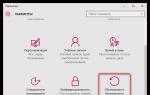
Now let's configure the color management system parameters. To do this you need to either go to the menu Editing - Color Settings (Edit-ColorSettings) or press the key combination SHIFT+CTRL+K. The settings window will open

In line Settings select from the drop-down list Universal settings for Europe. Thus, the main working space for the RGB model will be sRGB IEC61966-2.1. This completes the color adjustment.
You can use the preinstalled environment as a working environment Photo. You can select it in the upper right corner of the program window. You can then customize the program's palettes as you wish.

Now you need to restart the program and you can get to work.
Few Photoshop users, after processing a photo, immediately send it to print. After all, we are all so used to sharing our pictures on the Internet, not to mention showing our colleagues, friends, and acquaintances photos on a phone, tablet or other gadget. But still, what should you do if you need to print a photo? Do you need to hope that luck will smile and the photo will turn out to be of high quality, or prepare the image for printing? If you decide to engage in the preparatory process, then there is a need to correctly perform all operations so as not to waste time.
Of course, most readers might be thinking, "What can I do wrong here? Isn't it enough to run Image >Mode >CMYK and solve the problem once and for all?"
The fact is that the default method in Photoshop for converting to CMYK mode does not take into account certain moments, which can have a negative and unpredictable effect on printing.
What are CMYK and RGB modes?
RGB mode is a method by which the image is visually displayed on the screen using three colors Blue, Green and Red, and after mixing the pixels of these colors, the final result is the desired hue.
And CMYK is a distribution of Black, Yellow, Magenta, Cyan and colors to implement displacement networks that distribute patterns of dots of variable density and size on a “sheet of paper”, which is exactly what it produces the ability to get the desired color. When we look at a CMYK image, we are only seeing a simulation of the mode; in fact, we are seeing the RGB mode into which the image was “on the fly” converted to display it, because the monitor does not support the CMYK output method.
Increasing points
So what should you do at the very beginning? To correctly convert an image to CMYK mode, it is necessary to solve several problems and, first of all, Dot Gain. After the image has already been printed, it is easy to notice that it consists of small spots made by the printer's ink, depending on the quality of the paper used, they (the spots) expand from the center to the outer sides.
To test the printer, a pattern is most often printed; it consists of dots with a diameter of 1 millimeter. Initially, the points interact with paper sheet of a similar diameter, but after some time, the points may increase in value, which leads to small change colors. This may be due to both low-quality paper and bad ink.
Using Photoshop you have the ability to control how these dots are printed, and you can control their brightness before the final output. This is done through the File > Print with Preview menu, Dot Gain parameter. To comply in this case (when the points have increased in size), a decrease in the points is required so that the expansion becomes equal to one millimeter.
Ink quantity
Another problem is the correct distribution of ink on the paper, as well as the total amount of ink. In order to avoid ink getting into the same areas on the paper, it is necessary that the sum of their four values does not exceed 300.
The number 300 is actually an average, a kind of universal value. Most newspapers and magazines set even lower values as the limit, so check these parameters before submitting your image to print.
For example, you can distribute the colors as follows (the correct way): 90 C, 90M, 100Y and 0K, thus the sum is 280 (90+90+100+0). But such a distribution will be incorrect: 100C, 100M, 100Y and 100K, because in this case the sum will be equal to 400. The main thing is to really understand that visually the ratio of 20C, 20M, 20Y and 20K looks the same as 0C, 0M, 0Y and 0K. The factors influencing this were discussed above.
Convert to another profile
Let's move on to the practical part. Namely, we will take control of all, or almost all, factors that can negatively affect the printing of an image. Often, when creating a PSD file containing multiple layers, different color modes, etc., it is impossible to track all the changes in the CMYK mode.
Therefore, most users create/process an image in RGB, apply filters that are not available in another color model, and only convert the result upon completion of the work.
There are several ways to do this. One of them is executing the command Image >Mode >CMYK [Image >Mode >CMYK]. This method mathematically transforms the image, without paying attention to the problems associated with this conversion.
Another way is to execute the command Image >Mode > Convert to Profile, where you need to find the definition area and select Custom CMYK from the Profile drop-down menu, after which a dialog box will open. as in the picture below.

Set the parameters as in the figure, they are optimal.
In this fairly simple way, after careful consideration, correct conversion to CMYK mode is achieved.
Probably every professional photographer and those who make money by photographing weddings, selling photos to stocks, etc., have thought about the “camera - computer - printer” combination. I think that not all of them know, and bind the created profile to the monitor. Among other things, for correct color rendering, the profile is necessary for both the printer and graphics programs. For example, the most popular photo editor, Adobe Photoshop.
Color reproduction or correct display of colors on the monitor and when printed on a printer, has always remained a stumbling block digital photography and preparing the layout for printing. The reason for this is individual color transfer parameters on each device in the pre-press image preparation cycle.
At the moment of shooting one of the frames, the digital matrix of your camera registers the color itself and the intensity of its glow on each light-sensitive element (point), forming an image, and its result is recorded in a file that we can see on the computer monitor and other playback devices.
The color of the pixels in the resulting image is described by codes that lie within a certain color space. Color space (color model) is a coordinate system in which each combination of numbers corresponds to a specific hue).

The color models are as follows:
RGB CMYK XYZ HSV (HSB) HSL RYB LAB PMS (Panton) LMS Munsell NCS RAL ProPhoto YUV YCbCr YPbPr YDbDr YIQ
Color models or color management systems differ in color gamut. Graduates of Moscow State University of Printing will probably immediately remember Mr. Andreev and his lectures on pre-press processes :).
Most cameras used for professional photography give the photographer the ability to select the color space in which to save photographs. It is worth considering that when photographing in RAW format, the color space is not selected, since this format can generate an image file in any color model.
When you open digital image files in various programs or print them, color profiles continually convert those images from one color space to another to display colors correctly.
If you have problems printing ( incorrect color rendering relative to the monitor) on a home printer, then do not bother setting up the printer for the monitor. Start profiling the bundle
you need to start with the monitor and only then think about setting up the printer.
How to achieve the correct color rendering:
- First, load the correct profile for the monitor, ideally created manually using a calibrator.
- Make sure your monitor is calibrated. Then find or manually create the correct profile for the printer, designed specifically for the consumables used for printing (type of paper, ink).
P.S. When changing the type of ink or paper, you must use new profile!!!
Most Common Color Spaces sRGB And Adobe RGB . Most often used in digital cameras sRGB, it is also used to convert images and subsequently publish them on the Internet, because most browsers work with it correctly.
True, this color space has a slight drawback of sRGB - a bias towards the red zone, which causes a reddish tint in the photo due to the high sensitivity to white balance settings. In turn, Adobe RGB space has approximately the same balance of red and green, which reduces sensitivity to white balance errors. Note that Adobe RGB works well, for example, in photographs of autumn landscapes, when, along with warm colors, it is necessary to display many shades of green.
WideGamutRGB and ProPhotoRGB color spaces are needed in special cases: performing precise color correction and maintaining maximum shades. For example, professional photographers, since a monitor or printer that supports such color profiles is rare.
The camera creates image files containing information about the coordinates of pixels in a certain digital space, and the computer, determining the coordinate system - color space, reads
These numerical values are reproduced in the image.
Frequently encountered problems of inexperienced photographers
- Lack of identity between camera and monitor: the image on the camera display looks colorful and rich, but fades on the computer monitor.
- Lack of identity between 2 monitors or a monitor and a photo printer: the colors of a photograph processed in Photoshop look correct on the monitor on which the processing was carried out, but when viewing a photo on another monitor or a printout on a photo printer, distortions in color shades become noticeable.
Founded in 1993 by Adobe, Agfa, Apple, Kodak, Microsoft, Silicon Graphics, Sun Microsystems and Taligent. International Color Consortium(International Color Consortium, abbreviated as ICC) with the aim of developing a universal color management system without reference to a computer platform. The result of their fruitful collaboration is a standard against which any color device can be assessed. Thus appeared color profiles and the concept arose profiling of devices for working with color (monitors, printers).
Probably many people noticed that color profile file extensions are designated as .icc And .icm.
What is a monitor (printer) profile and what is it for?

Color profile- this is a file containing a description of the specific characteristics of the equipment and the optimal values of the settings for its correct operation with color. For example, a printer profile may contain information about the amount of ink required to pass through the nozzles. This information has a beneficial effect when reproducing a specific shade on a specific type of paper after receiving the finished (processed) image in Photoshop (pre-press photo preparation).
Monitor profiles take into account its real capabilities (color gamut, backlight type) for optimal display of the image on the screen, taking into account the fact that the original image could have been created by a camera with a profile that has a larger color gamut than the monitor can physically display with its matrix.
Profiles are a connecting link (adapter) that allows devices to work harmoniously and smoothly with color, and the user to achieve stable and predictable color rendition when transferring images from a camera to a computer, and from a computer to paper and other types of media.

Factory monitor profiles
Everyone noticed that the new monitor comes with a disk with drivers and setup utilities. Actually, the driver itself is not required for the monitor to work, but the profile for the monitor, which is hidden under them, is useful thing(not always :)), since the manufacturer supplies it to optimize color reproduction.
Running the installer software your monitor, you will install files with .icc or .icm extensions in the following folder: C:\Windows\System32\spool\drivers\color.
Unfortunately, the standard profiles of many monitors leave much to be desired. The reason for this is the standardization of the profile for the entire line, without taking into account the fact that each copy has individual color rendering characteristics. This is especially true inexpensive models, where the quality of the matrix and the uniformity of illumination are far from ideal.
Manually creating a profile for a monitor
Now you know that a monitor's profile is not limited to information about its technical specifications and features, and also contains a configuration file that can fundamentally change the color balance
by changing the signal coming to the monitor from the video card.
Attention! At this link you can find a table of calibrated color profiles for various monitor models and recommendations for hardware settings.
Printer profiling | Installing a profile on the printer

With that how to install a profile on a monitor we figured it out, and now we may need
printer profiling. Especially if the print quality began to suffer after installing the profile on the monitor.
Factory Priiter Profiles
Of course, all printers have a factory profile, which is usually recorded on a disk with software included in the kit or with the ability to download it on the manufacturer’s official website. But it is not a fact that such a profile will provide correct color rendering when printing photographs, even observing the use of original Supplies(one or more types of proprietary paper and ink) recommended by the manufacturer. The main reason for possible incorrect color rendering when using a factory profile is that there is no consideration of the individual characteristics of the printer. Probably, this will be enough for many users, but only in the absence of alternatives and strict quality requirements.
Custom Printer Profiles
Most will complain that the original consumables are quite expensive, not to mention the fact that for professional photographers who are creative in their work, they are simply not suitable for realizing their plans. But when using third-party paper and ink, you may encounter significant color deviations, which may be caused by an unsuitable color profile. Any professional printer knows that slight changes in paper density and ink viscosity affect the result, and with a photo printer, we will get a photo with the correct color rendition by changing the printing configuration. Third-party custom profiles cannot be used on the printer, as errors in the ink-to-paper bond are inevitable ( various parameters). The way out of this situation is to create an individual profile for your own paper and ink. If you take the issue seriously, you will noticeably improve the color rendition.
2 ways to create a profile for a printer
I’ll say right away that we will create our own profile for the printer at home without using special equipment.
1 way. Using the Color DarkRoom plugin for Photoshop.

This method involves printing a test scale one by one. The user changes the settings of the RGB curves and channels by eye until the display of the test target is as close as possible to its display on a calibrated monitor.
Attention! If the monitor is not calibrated, then there is no point in setting up the printer.
Method 2. Creating a profile using a scanner for home use.

The essence of the process: you need to print a profile card (test target) and scan (without color processing). Next, upload the file obtained after scanning into the Pantone Colorvision Profilerplus plugin in Photoshop, which will generate a new profile for the printer in semi-automatic mode, taking as a basis the difference in color rendition of the reference image of the test target in the original scanned image file.
The disadvantages of this method are possible deviations in the color rendering of the scanner. You can “finish” the results using the above-mentioned Color DarkRoom plugin. Even despite the difficulties, these methods are an excellent option for printer profiling. Of course, it is impossible to achieve the color accuracy of printing presses, but you will gain control over color and predictable results when printing photos.
Professional printer profiling
To achieve maximum color accuracy on a printer, its profiling must be carried out using an expensive device - spectrophotometer. This device is much more accurate than an office or home scanner. Using it, you can more accurately take indicators from printed targets, therefore, and build a profile with minimal errors. Of course, it is not advisable to buy a spectrophotometer for home use, since the services of specialized companies engaged in professional printer profiling. It is possible that you will use your friend's or acquaintance's spectrophotometer, or temporarily borrow the device from work.
So, to get a professional profile for your printer, you will need to print test targets according to the requirements published on the website of the company offering profiling services, and send them in an envelope at the post office (or by courier). Make sure from reviews or user advice that the company provides high quality services.
As a result, you will receive the most accurate profile for the printer, but it is worth remembering that each profile is suitable only for one type of paper and ink, that is, when changing consumables, you need to create new profiles.
The method is expensive, so think in advance, perhaps you can limit yourself to doing it yourself printer profiling.

Datacolor's SpyderPrint hardware and software kit allows you to quickly and accurately generate a profile for the printer for certain inks and papers.

Installing a profile to a printer in Windows 7 is done in the same way as linking a profile to a monitor (see the instructions “How to install a profile to a monitor”). The only difference is that in the device selection window you need to select a printer instead of a monitor.
Working with Color Profiles in Photoshop
Monitor calibration, printer profiling... And the optimization of color reproduction does not end there. You ask: “What else?” The fact is that many professional programs for working with graphics they have an autonomous color management system. These systems were needed when OS ICC profiles were not yet fully supported. Developers of photo editors and graphics programs initially focused on independent internal settings each individual program, since full support for iCC profiles at the OS level appeared starting from Windows versions 7.
It must be taken into account that the image observed on the monitor or on the print is not the original picture, but only an interpretation created by the profile from the original graphic file. In other words, this is an attempt to fit a large color space into a small bottle of color reproduction limitations specific device: monitor or printer. Thus, the real original reference image with all the information about colors and shades is the one that exists in digital form in the Photoshop window with the specified color profile.
It is important to have the ability to maintain the quality of an image at the initial stage, without first losing all the information about it with a narrower profile, and to open it with the correct initial settings in the workspace of a photo editor program. Otherwise, all the efforts to calibrate the monitor and profile the printer will not have much impact on the final result, since it will still not be possible to gain control over the color.
When creating a new file in Photoshop program You should immediately set a color profile for working with the image. This will not affect the display of the image on the monitor, but will set the “real” color frames for the original image.
In the “File” menu, select the “New” command and in the dialog box, expand the list of expert settings by clicking on the arrow next to the “Advanced” item.
Pay attention to the list that appears for selecting a working color profile, the “Color Profile” item.

At this point, you should select the color profile in which the source image will be processed. It is from this “source” that the color management system will convert the image into the color profile of the monitor for display on the screen and into the color profile of the printer when printing, so it is important not to make a mistake with its choice, so as not to lose quality.
The best choice is to rely on the following rule: the original color space in which the original image files were obtained must match the working color space.
For example, if the Adobe RGB color space was set in your digital camera when taking photographs (many cameras allow you to select a color space), then it is better to use the Adobe RGB profile (1998) as the working space of the Photoshop photo editor.
The sRGB IEC-61966-2.1 space is suitable for files without an embedded profile, that is, if you are working with images obtained using an unknown model of digital camera or scanner. This color space is ideal for web design, but is not very well suited for photo editing and professional printing as it tends to lose shades of blue. Profile
Adobe RGB (1998), on the other hand, is more suitable for pre-press photography and is adopted as the standard for editing RGB images intended for conversion to CMYK (this is the space that images are typically converted to when printed on most printing machines).
If you plan to print photos at your home in the future inkjet printer, then as the initial workspace in Photoshop you can select a profile “with a margin” of quality - ProPhoto RGB. This type of RGB space has a wide range of colors and is well suited for preserving the gamut
images in RAW format when they are initially converted to RGB, but if the original image was obtained in JPEG with the standard Adobe RGB profile, then it is better to select Adobe RGB as the working space)